How do I turn users into leads? More than one advertiser has faced this issue. Sometimes, in order to attract and retain the user, the advertiser has to use all possible sophisticated and non-trivial methods. If you are closer to the “bright” side, then landing pages are considered one of the safest and fastest ways to expand your audience.
You can make a landing page for any product or service that you promote! In addition, you will pay much less than for the site and its promotion, and as a result, you will get the same number of users.
Landing page and its application
We use many other names: landing page, pad, target page and so on
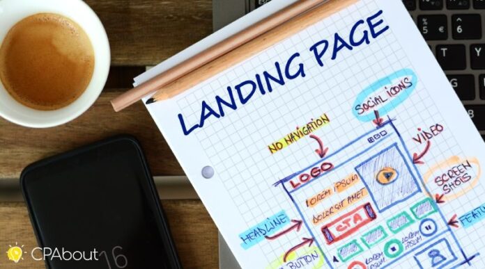
The purpose of this page is to push the user to perform a targeted action, which can be clicking on a link, buying, clicking, calling, viewing, sharing, or filling out a form. In addition, landing pages create an environment around your product, increasing its value in the eyes of potential customers.
Now let’s look at what makes the level of landing page conversion really high. There is no perfect recipe for creating a mega-converting landing page because not everything works the same for everyone. Today we are going to share with you useful findings and tools that will make your landing page workable when combined correctly. Well, let’s go!
- Quality image
A landing page is the “face” of your brand, which displays its values in the most concise and perfect form. In order not to lose face, do not skimp on the visual component. After all, catchy images, videos and GIFs will be the first thing that the user will notice. Even if you have worked hard and edited the text to perfection, your landing page will not convert without decent images.
High-quality images that reveal the essence of your product will work well. It doesn’t really matter whether you buy images or make them yourself as long as the visual image of the landing page is connected to the perception of your brand.
- Word of mouth
People are more likely to buy if they have heard flattering reviews of a product from someone. Why don’t you add your landing page with a couple of reviews from your real users? This way you will increase the trust in your product/service and be able to get new customers.
- Less freedom means more sales
What product do you want most? Which is not available. Take a pinch of drama and season your product with the “limited offer” phrase. In addition to texts, this idea can be played out in an interesting way with the help of visual elements: a timer, a ticking clock, a low-charge battery, a countdown, etc. If the buyer is faced with a dilemma “to take or not to take”, this technique will turn uncertainty into “must take”!
- Avoid endless scrolling
A good landing page differs from a bad one in that it is super informative and easy to view. State your thoughts briefly, and there’s no need to spread it into 4 sheets. Your potential leads will not read the “sheet” of text, respect their time and save your money. Show the amount of content which can be enough to fill the maximum length of the scroll bar. Vertical scrolling is recognized as the optimal solution for desktop and mobile devices. But horizontal is not always convenient and often causes irritation. Want to monetize? Choose vertical scrolling with a scroll limiter.
- Short forms
Let’s imagine that your user has completed the desired target action. What’s next? And then they go to the feedback form. Make sure that they don’t get a shock from seeing 20 fields to fill in. Long forms are archaic, and short but informative questionnaires that take up a minute of time are now in the trend. Focus on key questions like first name, last name, phone number, date of birth, email, country, and bank details. This way you will get the necessary data without spooking a potential client.
- Directed signals
The algorithm of actions is the key to guaranteed lead generation. If you need a user to click on a button, click on a link, or fill out a form, let them know. Don’t be afraid to direct the user’s actions, on the contrary: you will help them navigate your landing page. Experiment with arrows, bright buttons and symbols, change the font, work with the CTA and add info-graphics. You will see that it works flawlessly!
- An offer that one can’t refuse
When the temptation is too great, it’s rare for anyone to resist it. The same goes for a landing page. To increase sales, the most “working” schemes are used, such as gifts, promotions, discounts and bonuses. In short, everything that can be obtained for free. Add this word to any offer and voila! Users are in your pocket. To achieve maximum effect, add your landing page with appropriate images and animations. No one can pass by!
What do you need to remember?
- Landing pages are a great opportunity to present your product/service in the best possible light. Don’t be afraid to be creative, because the success of the offer and conversion depends on it! Just remember about A/B testing and detect failures in campaigns in time.
- Be inspired by someone else’s example. Competitors can give you a boost and ideas for creatives that can be implemented correctly for your project.
- Save your time. Now you don’t need to make a whole landing page from scratch, you can take any template and adapt it to yourself!
- Stick to the basic standards for the crafting of creatives. Incorrect structure, completeness of text inserts, placement of blocks, and even the frequency of visual content may not affect the message in the best way.
- Learn from the best. Appreciate the advice of marketing experts who have more than a dozen successful campaigns to their credit. And then everything will work out!

